I’ve done a lot of research for developing this blog series, Your Brand Identity. I was able to research a lot about color psychology, font readability, and the importance of good photos. But one thing I found a hard time reading more about, the thing that I find is just as important in your brand identity, are Graphic Elements. So I’m kind of proud to bring you this article, so you can learn more about this important part of the brand process!
Graphic elements are the flourishes that you can add to your web and print pieces that make sure all of your designs are tied together. They will be elements that you can repeat on any brand piece you want to make sure that your brand shines through, no matter what the medium.
What Do I Mean by Graphic Elements?
Here are some super easy examples that I made up to spruce up this image of a city:
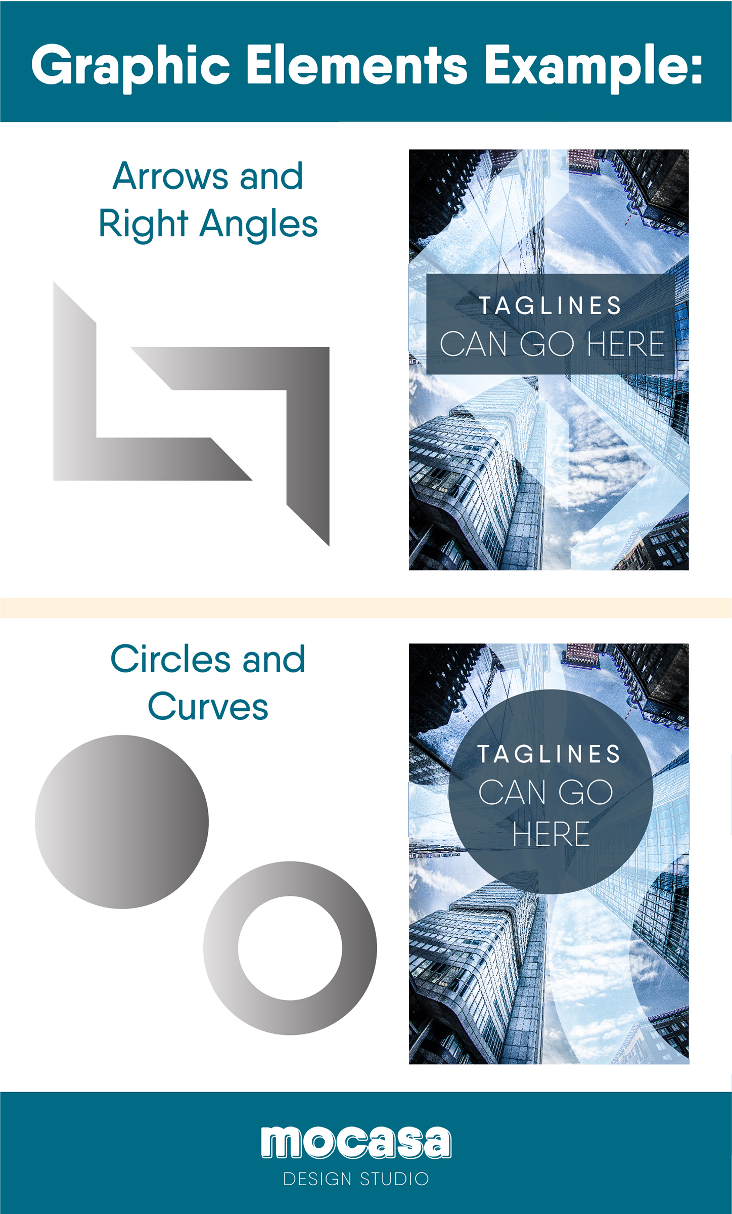
You can see how these types of adjustments can really add spice to any design. Choosing one or two and using it consistently will really bring out the individuality of your brand and make you recognizable on the spot.
Let’s See Some Real World Examples
Of course, just because I couldn’t find any articles on this topic, doesn’t mean it doesn’t exist. And I have proof! Here are some great examples of companies using graphic elements to further their brand identity.
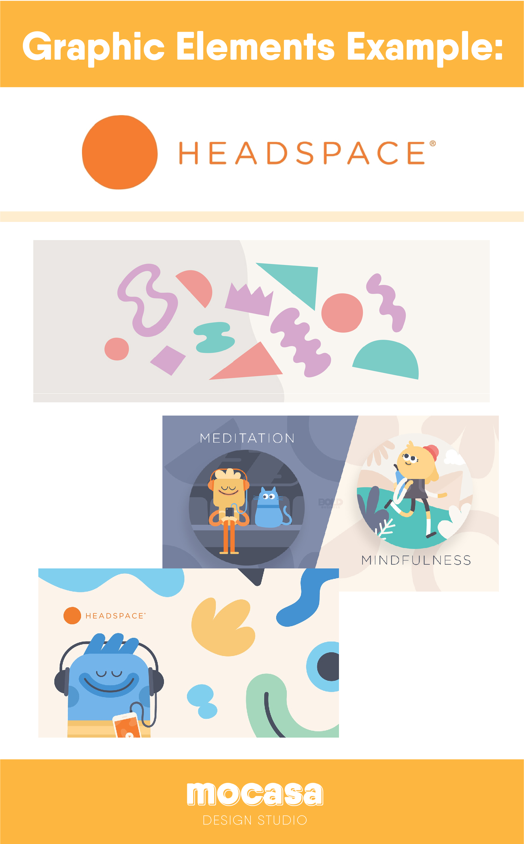
Take a look at these designs from Headspace. They have a cohesive set of illustrations to represent their brand. They have little smiley faces, that each mean a different type of meditation, and they’re style is organic and cute. And whether you go on their website, look at their promotional pieces, or even their social media, it’s all consistent.
Here’s another great example of graphic elements in a real brand:
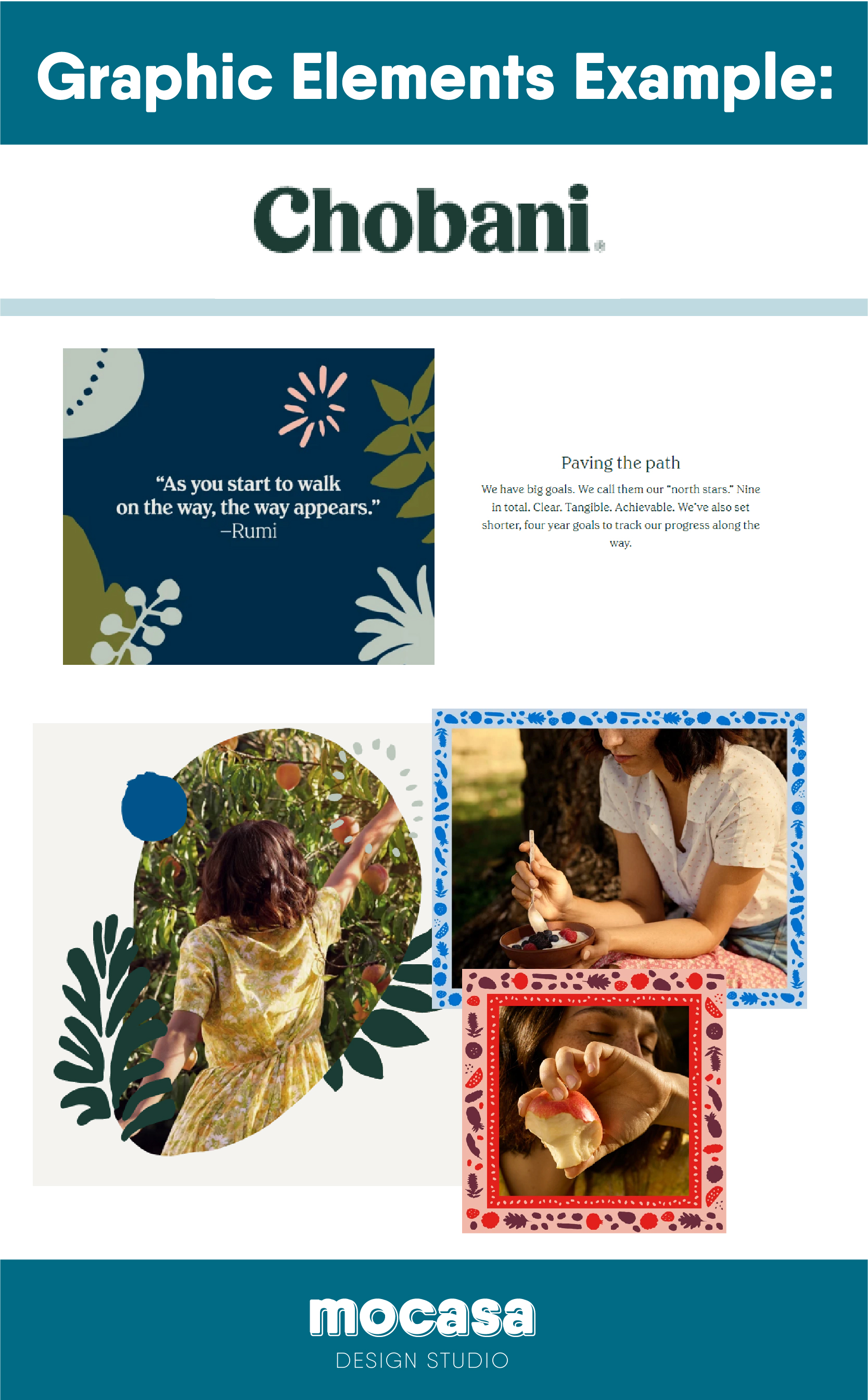
Chobani uses graphic elements to showcase their natural ingredients and healthy values. They use flowers, plants, and fruits in a beautiful illustrative style, which they use as framing designs to make their photos pop. And even for their instagram posts, those illustrations bring you right back to the idea that Chobani’s brand is showcasing: healthy and natural lifestyles.
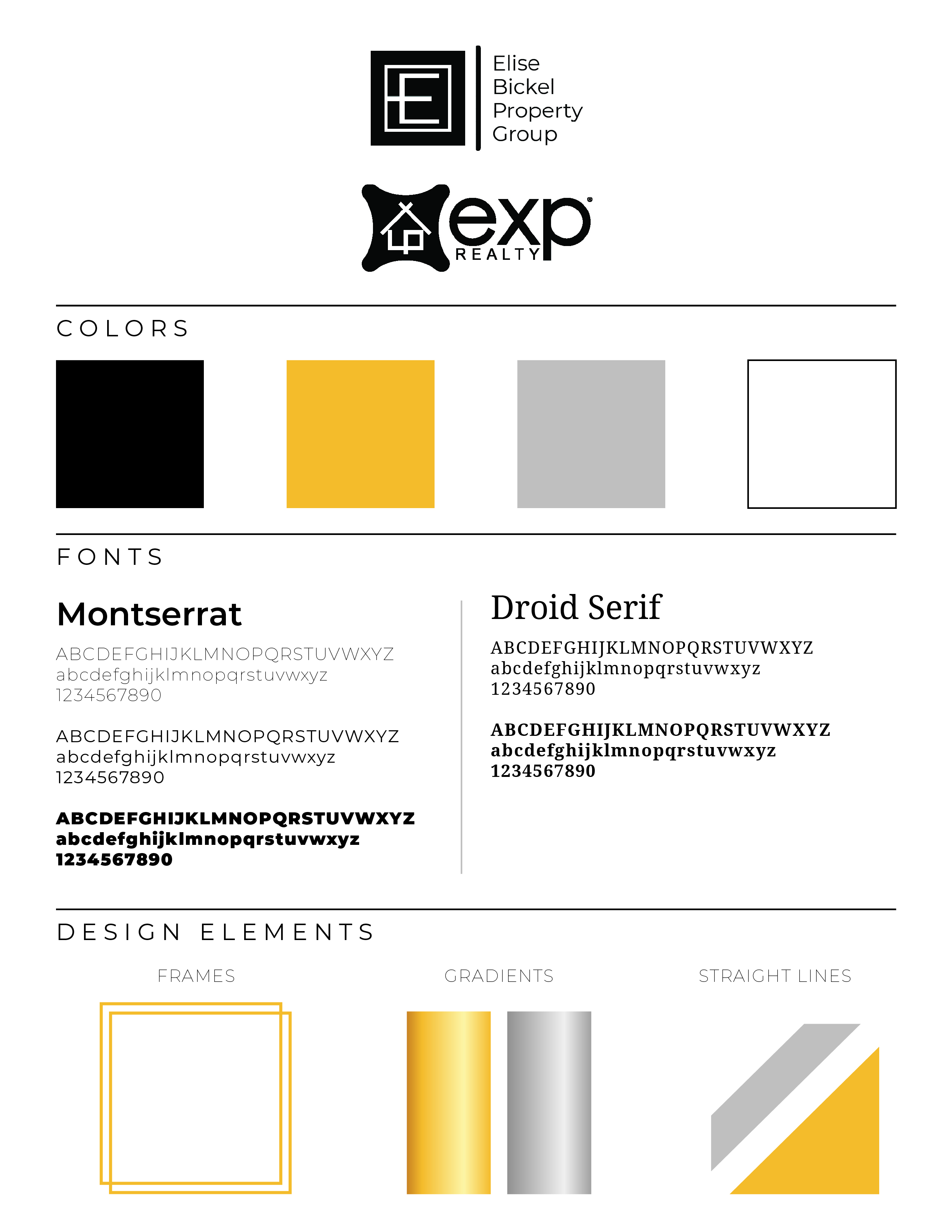
I recently did a rebrand for a high end real estate team – EBG Properties – and I had a lot of fun deciding what graphic elements to use. They wanted high end styles, along with black and gold colors as a shout out to Pittsburgh. (And I was happy to help showcase their pride in their city, despite being a Cleveland sports fan, myself. Go Browns!)
